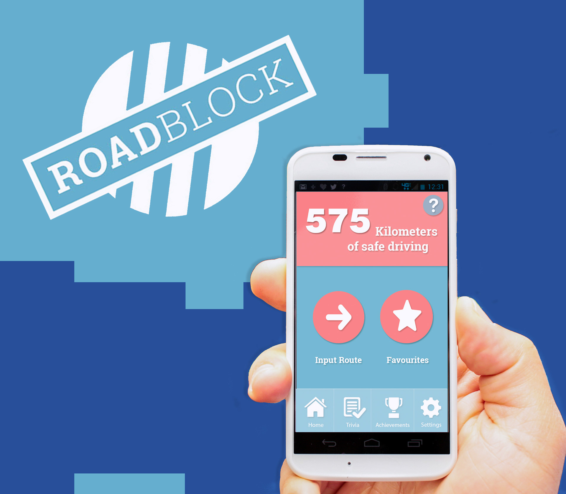
Roadblock (Axure prototype here) is an application which aims to raise awareness around and reduce instances of mobile phone induced driver distraction.
Created as part of IADT’s 3rd year Group IT Project, the development of this app required strong communication skills and teamwork throughout its design lifecycle. My roles during this project varied. I was responsible for the creation of a number of deliverables including wireframes, paper prototypes, Photoshop mock-ups and Axure prototypes. I was also heavily involved in each stage of user testing.
Ideation
The first step in the creation of RoadBlock was brainstorming app concepts as a team. After discussing which issues could be addressed with an app we agreed that we would tackle distracted driving. According to the RSA, using a mobile phone while driving makes a person 4 times more likely to crash. Evidently then, this a serious issue which needs to be addressed. Having all studied the effects of divided attention while driving as part of a Cognitive Psychology module we each had a grounding in the area.
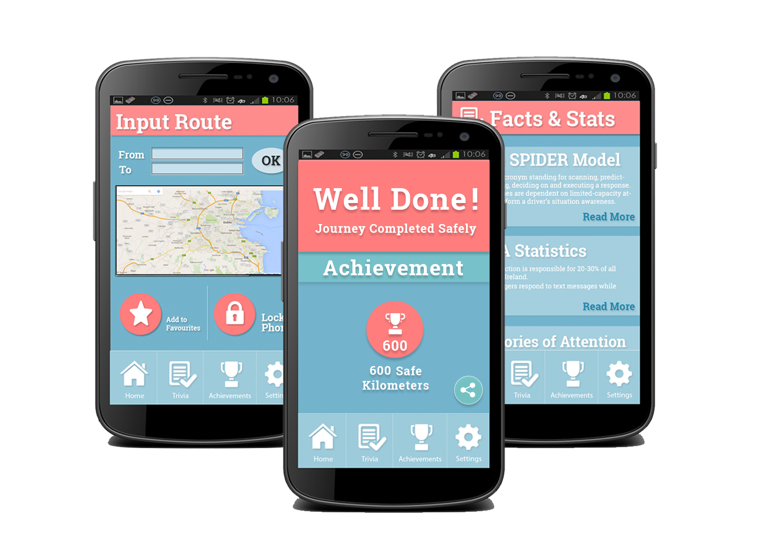
A number of features for the app were suggested but the ones that made it to the final product after user research and interviews were:
- Phone Lock (with “Emergency Call” or “Give Up” option)
- Scoreboard of total number of safe kilometres/miles driven
- Road safety Quiz
- Road Safety and Divided Attention Facts and Stats
- Achievements (which can be shared with friends through social media)
- Settings
Early User Research
Initial user research took the form of informal interviews. At this stage, our main discovery was that a number of teenagers and young adults do, in fact, use phones while driving simply as a force of habit. Our app then, would address habit breaking. We used the information gathered to create user personas which would guide our design.
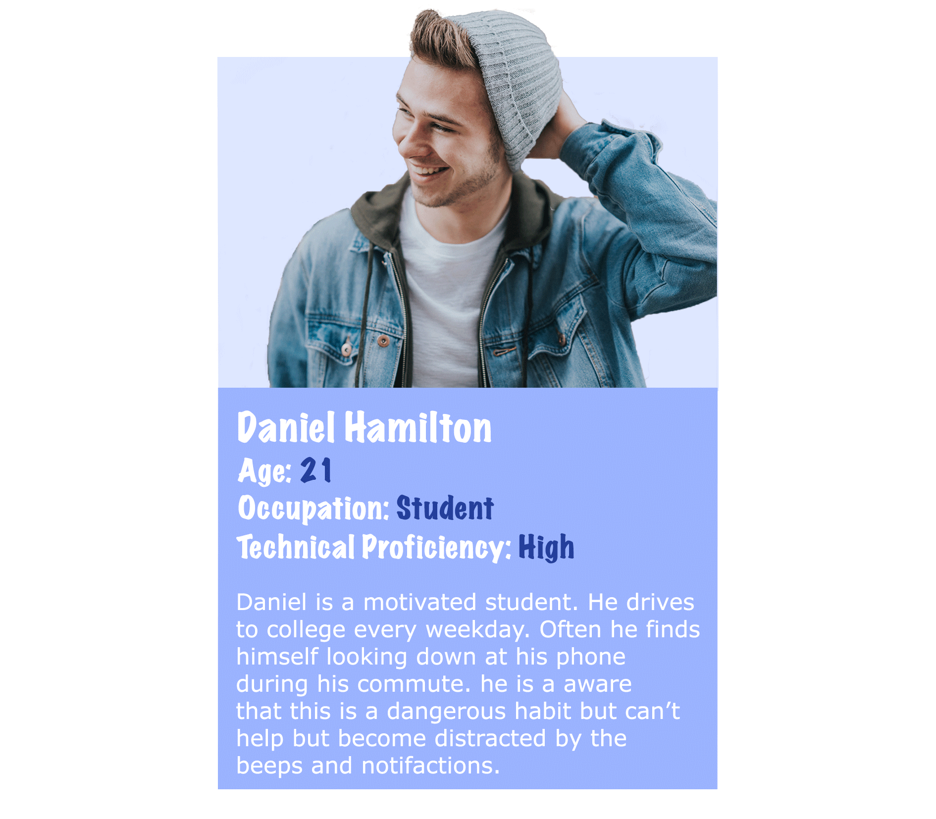
One of the personas created
We also carried out competitor analysis. If you would like to read about some similar apps to RoadBlock please visit the full RoadBlock site here.
Wireframing and Prototyping
Once user research had been completed, work on paper prototypes began. These were rough but allowed us to test the key functionalities of the app without investing too much time into Photoshop mock-ups.
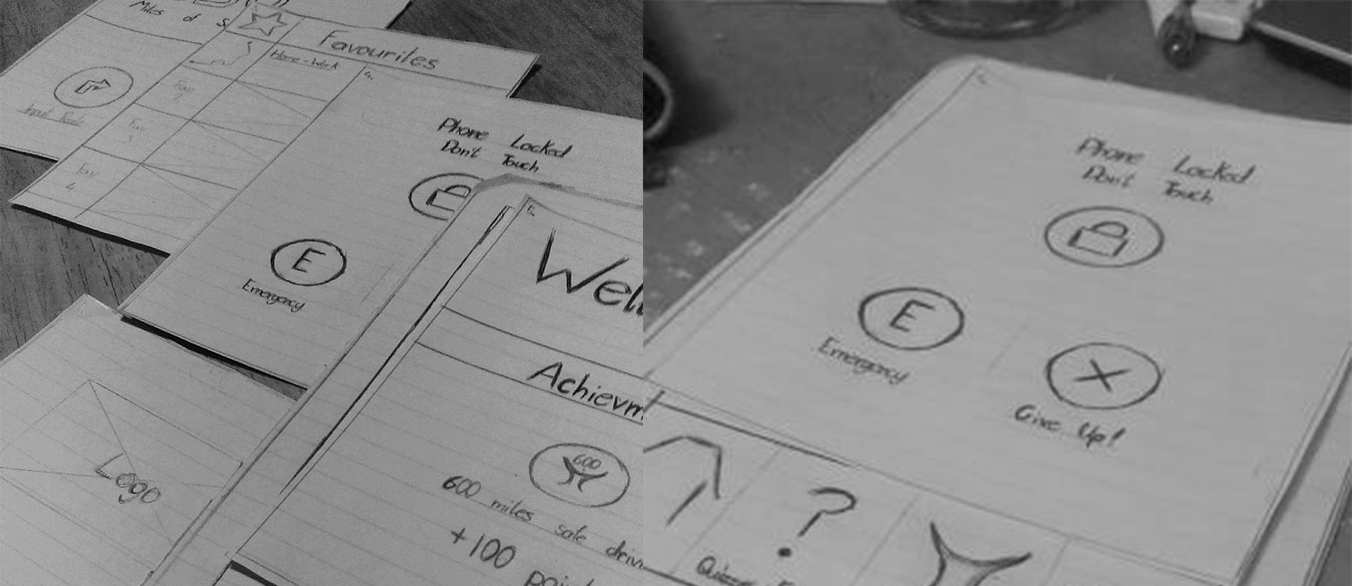
The next step in the prototyping stage was the creation of initial Photoshop mock-ups and Axure prototypes. It was at this point that visual and overall aesthetic feel of the app was considered. Here we were able to receive feedback that could be applied to the final version. The main points found during testing at this stage were:
- Navigation Difficulties (some users could not find “Trivia” page).
- Colour scheme did not appeal to many of the users.
- Colour scheme was inconsistent between certain pages.
- Users could find no way to add a route to their “Favourites”
All of these issues were rectified in the final version and a side-by-side comparison of screens from the original prototype and final product can be viewed below.
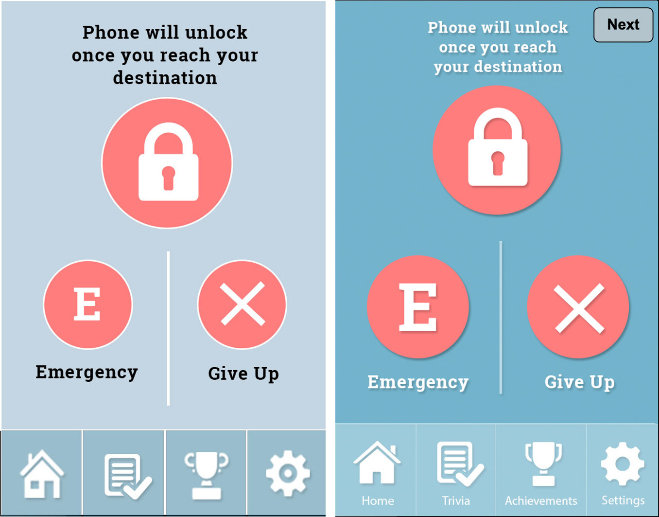
An example of screens before and after receiving user feedback